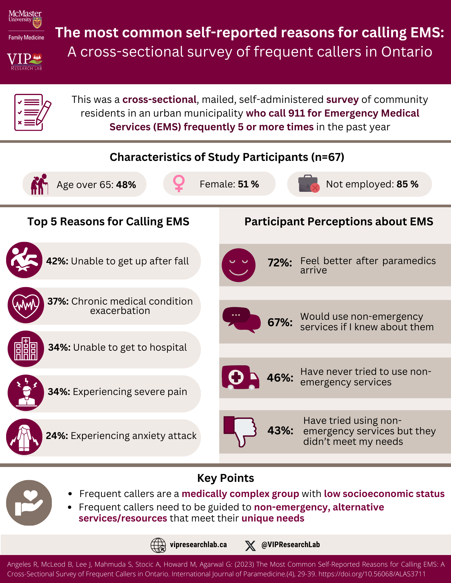
The title written at the top of this infographic is, The most common self-reported reasons for calling EMS: A cross-sectional survey of frequent callers in Ontario. Beside the title towards the left are the logos for McMaster University Family Medicine and VIP Research Lab. Below the title, to the left of the infographic there is an icon of a pen and a checklist on a paper with text beside it that says, This was a cross-sectional, mailed, self-administered survey of community residents in an urban municipality who call 911 for Emergency Medical Services (EMS) frequently 5 or more times in the past year. Beneath this is a text that says Characteristics of Study Participants (n=67). Under this text are three elongated grey-coloured ovals that are centered on the infographic. In the first one, towards the left is an icon of an elderly man and woman with text that says Age over 65: 48%. In the second oval is a pink symbol representing females text that says Female: 51%. The third one, towards the right, has a symbol of a dark grey briefcase with a red x with text that says Not employed: 85%. The middle of the infographic is split into two columns. The left has a subheading that says Top 5 Reasons for Calling EMS. Below this are 5 white icons with burgundy circles behind them and grey elongated ovals with text in them to describe the icons. The first one is an icon of a person who has fallen down, with text beside it that says 42%: Unable to get up after fall. The second is an icon of a heart with an electrical signal in it with text beside it that says 37%: Chronic medical condition exacerbation. The third is an icon of a hospital with text beside it that says 34%: Unable to get to hospital. The fourth is an icon of a male person with shock signs above his head with text beside it that says, 34%: Experiencing severe pain. The last one is an icon of a person sitting on the ground with their hands to their head and shock waves beside them. The text beside it says, 24%: Experiencing anxiety attack. The column on the left has a subheading that says Participant Perceptions about EMS. Below that are 4 grey rectangles with burgundy and white icons on the left and text to the right of each of the icons. The first rectangle includes a smiley face icon with text beside it that says 72%: Feel better after paramedics arrive. The second one has a message icon with text beside it saying 67%: Would use non-emergency services if I knew about them. Under that is an ambulance icon with the text beside it saying 46% Have never tried to use non-emergency services. The last one includes a thumbs-down icon with text beside it saying 43%: Have tried using non-emergency services but they didn’t meet my needs. Towards the bottom of the page, there is a subheading titled key points. Below that is an icon of a hand with a heart above it with two bullet points beside it that say Frequent callers are a medically complex group with low socioeconomic status, and Frequent callers need to be guided to non-emergency, alternative services/resources that meet their unique needs. Across the bottom of the infographic from left to right is a website icon accompanied by the website name vipresearchlab.ca and the logo for the social media platform X accompanied by the handle @VIPResearchLab.
Download PDF